Maybe Christopher Morris, the real estate investor quoted in the 10/21/06 New York Times as anticipating a rise in property values because of the Atlantic Yards project, was right. Or maybe he was riding on trends that already existed, trends that suggest that blight and stagnation are trumped by development.
Indeed, as Brooklyn College sociologist Aviva Zeltzer-Zubida recently reported at a panel in June, "Housing Displacement in Brooklyn: A Discussion," there’s some stark evidence about gentrification trends, and they point directly to areas in the orbit of the Atlantic Yards proposal. It's not common for areas of poverty to nudge up against areas of wealth, but when they do, the poorer areas are vulnerable to displacement.
Looking at the map
That evidence is based on 2000 census information, which captured the beginning of the trend. In the map of Brooklyn’s housing patterns she produced, Zeltzer-Zubida reported a multi-faced segregation--with poorer households in the tracts colored red-orange and green.
She counted four types of housing tracts in Brooklyn, but most people live in the first two. In type 1 (red-orange), where 60% of Brooklyn residents live, the median per capita income in 2000 was $12,090; in type 2 (green), where nearly a third of Brooklynites live, it was almost $21,000. (The median Brooklyn household income in 2000--not the same as per capita--was $32,135 and certainly has gone up. Still, the poorer majority must be offset by a much wealthier minority to reach $32,135.)
But her analysis went well beyond income to include race, large families, owners vs. renters, and housing costs, among other things. In type 1 households, about 30% of residents are white; in type 2, it’s almost 60%. In the blue and yellow (types 3 and 4) tracts, incomes are considerably higher and more than 70% of residents are white.
Honing in on displacement
 In the type 1 census tracts, about a quarter of the people pay more than half their income in rent, which means their tenancy is precarious. “What I think is going on, and if we think about housing displacement, and the bottom line here is that orange next to blue or yellow presents risk of housing displacement. Somebody told me that I should show this to real estate developers and make a lot of money,” Zeltzer-Zubida said, to some laughter.
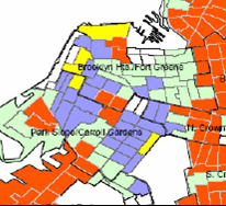
Indeed, if you look at the right side of the small map, where the blue nudges up against orange-red below a black line, that tract in orange-red includes Prospect Heights and Crown Heights.
What the Census says
 My eyeball analysis is that the orange-red tract east of blue is between Atlantic Avenue and Bergen Street, and Vanderbilt and Grand avenues--just east of the Atlantic Yards footprint. (Grand Avenue is just east of Washington Avenue, which formers the border between Prospect Heights and Crown Heights.)
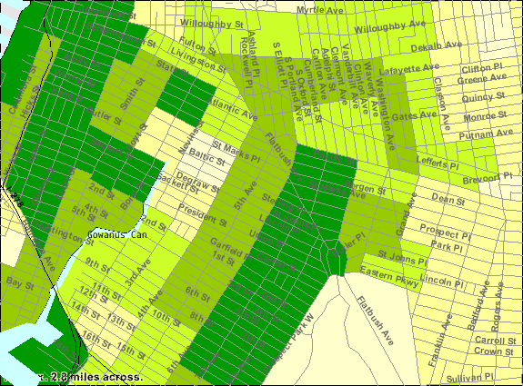
The incomes for the tract, according to the Census (below) do not precisely conform to what Zeltzer-Zubida reported, because she was analyzing per capita income (which depends on household income divided by household size), while the Census focused on household income.
Still, the Census confirms a dramatic transition going east from Vanderbilt Avenue below Atlantic Avenue, at the center of the map. Whereas the section to the west, between Sixth Avenue and Vanderbilt, is the wealthiest category (dark green), going east, the next tract, between Vanderbilt and Grand north of Bergen, is the middle category (light green), thus skipping the intermediate category (medium green).
(The wealthy segment would include most of the Atlantic Yards project. While there's a diversity of incomes there, including rent-stablized apartments, the presence of the Newswalk condos and some other high-end buildings undoubtedly raises the average income.)
Last month, in a New York magazine article headlined Brooklyn is Burning, with the subtitle “Do development and arson go hand in hand?” Mark Jacobson observed:
Within three months, from December 7, 2005, to February 24, 2006, there were eleven such fires along Prospect Heights’ “Pacific Street Corridor,” formerly home to single-story factories and flat-fix establishments but now part of the realty zone sandwiched between the escalating rent sprawl of Williamsburg and Fort Greene and the proposed Atlantic Yards megaproject to the West.
So, would the Atlantic Yards project stem gentrification, as ACORN and other proponents argue, or accelerate it? The component of affordable housing contrasts with other luxury development in the area, and thus has been seen to balance gentrification--except that much of the affordable housing wouldn't be accessible to average Brooklynites.
Also, given Zeltzer-Zubida's theory, the acceleration of luxury development near a poorer census tract makes vulnerable poorer neighbors who don't live in rent-regulated housing. It should be no surprise that luxury condos have begun to appear on and around Washington Avenue, in the transition zone.
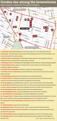
The development map
The map from the November 2005 issue of the Real Deal lists oodles of condo projects. Some of the info isn't correct--there's no plan to develop 636 Pacific Street, as far as I know, since it's a building slated to be demolished for the Atlantic Yards project--but you get the general picture. (Click to enlarge)
It certainly raises questions about the Empire State Development Corporation's Blight Study, which contends that only government action can change the 22-acre proposed project site:
Given the pattern of successful economic development in ATURA [Atlantic Terminal Urban Renewal Area] north of Atlantic Avenue and general neglect on the project site, south of Atlantic Avenue, it is highly unlikely that the blighted conditions currently present will be removed without public action.
Indeed, as Brooklyn College sociologist Aviva Zeltzer-Zubida recently reported at a panel in June, "Housing Displacement in Brooklyn: A Discussion," there’s some stark evidence about gentrification trends, and they point directly to areas in the orbit of the Atlantic Yards proposal. It's not common for areas of poverty to nudge up against areas of wealth, but when they do, the poorer areas are vulnerable to displacement.
Looking at the map
That evidence is based on 2000 census information, which captured the beginning of the trend.
 In the map of Brooklyn’s housing patterns she produced, Zeltzer-Zubida reported a multi-faced segregation--with poorer households in the tracts colored red-orange and green.
She counted four types of housing tracts in Brooklyn, but most people live in the first two. In type 1 (red-orange), where 60% of Brooklyn residents live, the median per capita income in 2000 was $12,090; in type 2 (green), where nearly a third of Brooklynites live, it was almost $21,000. (The median Brooklyn household income in 2000--not the same as per capita--was $32,135 and certainly has gone up. Still, the poorer majority must be offset by a much wealthier minority to reach $32,135.)
But her analysis went well beyond income to include race, large families, owners vs. renters, and housing costs, among other things. In type 1 households, about 30% of residents are white; in type 2, it’s almost 60%. In the blue and yellow (types 3 and 4) tracts, incomes are considerably higher and more than 70% of residents are white.
Honing in on displacement
 In the type 1 census tracts, about a quarter of the people pay more than half their income in rent, which means their tenancy is precarious. “What I think is going on, and if we think about housing displacement, and the bottom line here is that orange next to blue or yellow presents risk of housing displacement. Somebody told me that I should show this to real estate developers and make a lot of money,” Zeltzer-Zubida said, to some laughter.
Indeed, if you look at the right side of the small map, where the blue nudges up against orange-red below a black line, that tract in orange-red includes Prospect Heights and Crown Heights.
What the Census says
 My eyeball analysis is that the orange-red tract east of blue is between Atlantic Avenue and Bergen Street, and Vanderbilt and Grand avenues--just east of the Atlantic Yards footprint. (Grand Avenue is just east of Washington Avenue, which formers the border between Prospect Heights and Crown Heights.)
The incomes for the tract, according to the Census (below) do not precisely conform to what Zeltzer-Zubida reported, because she was analyzing per capita income (which depends on household income divided by household size), while the Census focused on household income.
Still, the Census confirms a dramatic transition going east from Vanderbilt Avenue below Atlantic Avenue, at the center of the map. Whereas the section to the west, between Sixth Avenue and Vanderbilt, is the wealthiest category (dark green), going east, the next tract, between Vanderbilt and Grand north of Bergen, is the middle category (light green), thus skipping the intermediate category (medium green).
(The wealthy segment would include most of the Atlantic Yards project. While there's a diversity of incomes there, including rent-stablized apartments, the presence of the Newswalk condos and some other high-end buildings undoubtedly raises the average income.)
Last month, in a New York magazine article headlined Brooklyn is Burning, with the subtitle “Do development and arson go hand in hand?”
 Mark Jacobson observed:
Within three months, from December 7, 2005, to February 24, 2006, there were eleven such fires along Prospect Heights’ “Pacific Street Corridor,” formerly home to single-story factories and flat-fix establishments but now part of the realty zone sandwiched between the escalating rent sprawl of Williamsburg and Fort Greene and the proposed Atlantic Yards megaproject to the West.
So, would the Atlantic Yards project stem gentrification, as ACORN and other proponents argue, or accelerate it? The component of affordable housing contrasts with other luxury development in the area, and thus has been seen to balance gentrification--except that much of the affordable housing wouldn't be accessible to average Brooklynites.
Also, given Zeltzer-Zubida's theory, the acceleration of luxury development near a poorer census tract makes vulnerable poorer neighbors who don't live in rent-regulated housing. It should be no surprise that luxury condos have begun to appear on and around Washington Avenue, in the transition zone.
The development map
The map from the November 2005 issue of the Real Deal lists oodles of condo projects. Some of the info isn't correct--there's no plan to develop 636 Pacific Street, as far as I know, since it's a building slated to be demolished for the Atlantic Yards project--but you get the general picture. (Click to enlarge)
It certainly raises questions about the Empire State Development Corporation's Blight Study, which contends that only government action can change the 22-acre proposed project site:
Given the pattern of successful economic development in ATURA [Atlantic Terminal Urban Renewal Area] north of Atlantic Avenue and general neglect on the project site, south of Atlantic Avenue, it is highly unlikely that the blighted conditions currently present will be removed without public action.

Comments
Post a Comment