From the New York City Department of Housing Preservation and Development, "Want to know if your income qualifies you for #affordablehousing? Check out our new income infographic to see where you and your family fit in."
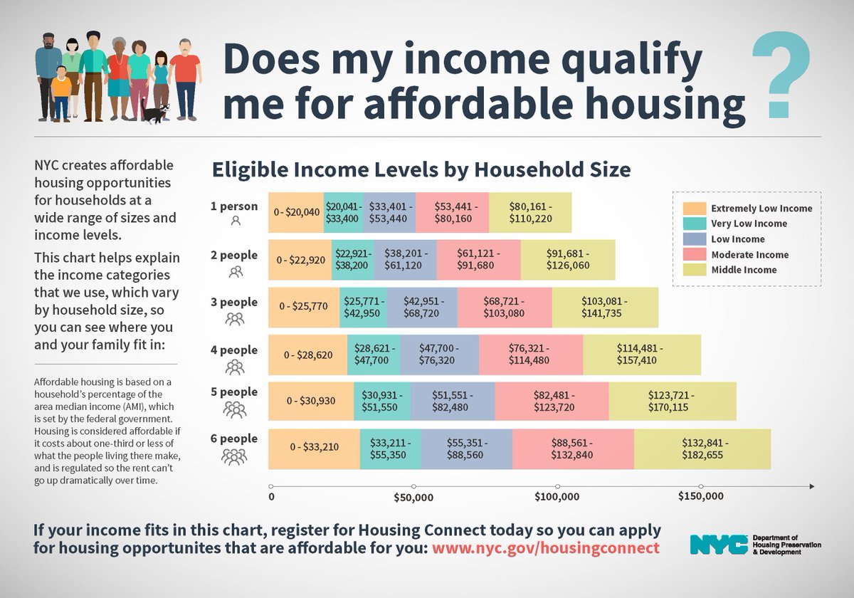
Note that the midpoint of moderate income (80% to 120% of Area Median Income, or AMI) is 100% of AMI, for example, in 2017, $95,400 for a four-person household. Also note that, because of the presence of wealthier suburban counties in the AMI calculation, the income figures hardly match city or borough median incomes.
Wrote Bob Gangi 3/30/18 in Gotham Gazette about Mayor Bill de Blasio's "sham progressivism":
Here's the translation into rents:

Note that the midpoint of moderate income (80% to 120% of Area Median Income, or AMI) is 100% of AMI, for example, in 2017, $95,400 for a four-person household. Also note that, because of the presence of wealthier suburban counties in the AMI calculation, the income figures hardly match city or borough median incomes.
Wrote Bob Gangi 3/30/18 in Gotham Gazette about Mayor Bill de Blasio's "sham progressivism":
A central problem is that de Blasio's plan artificially inflates what's considered "affordable," measuring a household’s eligibility by an Area Median Income (AMI) that includes all five boroughs and comparatively wealthy counties outside of the city: Westchester, Putnam, and Rockland. This card trick masquerading as fair practice opens the door for developers to build housing that ends up displacing families it supposedly serves.Well, while de Blasio could push for more affordable housing set at lower percentages of AMI (and he's made modest progress, compared to his previous plan, and more compared to that of his predecessor), that "artificial" inflation is a feature of city policy, not one he introduced. But it's fair to call it a "card trick."
Here's the translation into rents:
Comments
Post a Comment