Starchitect Frank Gehry gets some faint praise in an article headlined Making Waves (subscriber-only) in the Feb. 13 issue of The New Republic, while the lesser-known architect Enrique Miralles, according to critic Sarah Williams Goldhagen, deserves more respect for his effort to privilege landscape over wavy sculpture.
Goldhagen writes:
For well over a decade now, we have been flipping through glossy photographs and watching videos of Frank Gehry carefully studying crumpled wads of paper, selecting which one to slide across some large drawing table to an assistant-in-waiting, who will scan it into the computer and, with Gehry, endeavor to make and call it architecture.... In different iterations we have seen it all before, and before, and before, in the Guggenheim Bilbao, the Disney Concert Hall in Los Angeles, the Ray and Maria Stata Center on the MIT campus, the Fisher Center for the Performing Arts at Bard College, the Experience Music Project in Seattle, the Pritzker bandshell in Millennium Park in Chicago, the American Center in Paris, the proposed skyscraper for the controversial Atlantic Yards project in Brooklyn, and the proposed Guggenheim museums in New York City and Abu Dhabi.
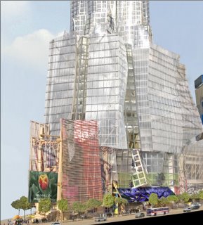
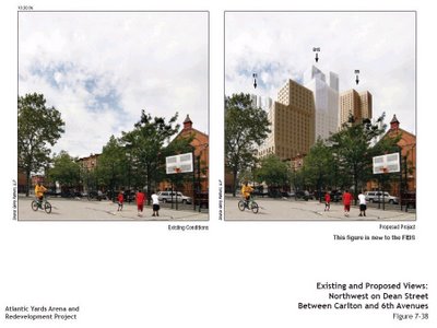
That's the only mention of Atlantic Yards (above), so her criticism below can't be directly applied to AY. Then again, Atlantic Yards is clearly driven by the scale of the project rather than an approach to landscape, as shown in the Gehry rendering below.
As the New York Observer reported, in a 1/25/07 article headlined This Guy Wants You to Love Atlantic Yards, Gehry brought in landscape architect Laurie Olin four or five months into the process. Only by demapping Pacific Street to create a superblock could the ratio of open space to population in the neighborhood nudge up rather than go down:
Mr. Olin admits that the site plan was put together to establish the parameters of the project—the ratio of open to built space—to go through the approval process.
Skin vs. function
 While Goldhagen praises Gehry for his innovative use of new digital technologies, she suggests the buildings have their flaws:
As riotous sculptures, Gehry's wavy buildings look impressive from the street--although even this is partly a matter of taste: to an artistically trained eye, he is far less compositionally talented than he, his clients, and the worldwide publicity machine that promotes his designs would have us believe. But even if one appreciates these buildings' exterior views, they often fail to reconcile their fancy skins with the demands of habitable, functional, enlightening interiors and outdoor spaces. Gehry's titanium-clad buildings (such as Bilbao and some others) convert sunlight into blazing heat. Many of these buildings have flowing opaque skins that discourage apertures to admit and sculpt and control natural light indoors. His overall approach to design suggests nothing about how to make a plan that resolves or stimulatingly interprets the building's program, makes spatial sequences, or folds into or works with its site.
Beyond the exterior
Other major architects now using digital technologies, like Gehry, "concentrate a large percentage of their design wattage on the exterior envelope," while Goldhagen points instead to to some other taking the next step:
These firms are using the computing power and the manufacturing and material possibilities of new digital technologies to integrate a building's exterior aspects with the many other--and equally important--considerations that go into making good architecture: the building's plan, sections, structural and mechanical systems, materials, program, site, light, space, environmental concerns, and so on.
 The Miralles example
Goldhagen points to a different exemplar, the designer of, among other buildings, the Scottish Parliament in Edinburgh:
The best of the younger architects owe homage, or should, to one master, and it is not Frank Gehry. It is Enrique Miralles, a Spanish architect who died in 2000 at the age of forty-five.
(Photos from the Galinsky site devoted to the Scottish Parliament.)
She suggests that his work encompasses more:
Although Miralles died young, some of his projects stand. They are exquisite--some of the most uncannily intelligent buildings, landscapes, and public spaces of our time. Many look exuberantly wavy, but not because Miralles and his partners spent time studying crumpled paper. Critics tend to brand these projects with adjectives such as "intuitive" and "emotive"--words that, in the vocabulary of contemporary architecture, connote curves, Big Personality, a predisposition for the irrational, and (for some) a feminized sensibility. But to pigeonhole the work in this way is at best imprecise, and at worst just wrong. From the stark, breathtaking Igualada Cemetery (1985-1994) on the outskirts of Barcelona to the quietly exuberant Scottish Parliament in Edinburgh, this work, like Gehry's, is often curvy--but it also masters the architectural qualities that Gehry's buildings so often deny, combining exquisite analytical rigor with an almost poetic control over topography, siting, spatial sequence, natural light, color, and materials.
A sense of landscape
Goldhagen suggests the issue is not so much sculpture but landscape:
When these projects take off into curves, it is because Miralles and company decided that curves are what a particular architectural challenge evoked. There is no aggressive monumentality here, no cookie-cutter high-end product dumped wherever the money exists to pay for it. There is, instead, sensitivity and study. Miralles and his colleagues receptively investigated the landscape and the site. They considered when and how the people who were to use the structure or the landscape might live in, move through, and prospect space; how they might touch, and imagine touching, surfaces. Sure, they made use of computers to actualize their ideas. But their architecture neither starts nor stops with skin, or with what digital technology offers. Steeped in architecture's history, Miralles used architectural precedents when they offered reasonable solutions to problems that, in the words of Viennese modernist Adolf Loos, had already been solved. Steeped in art, nature, and local traditions, Miralles playfully engaged architecture's metaphorical possibilities.
Slowing complexity down
Her conclusion:
Miralles and his partners, like Gehry, and like the digitally besotted forty something generation of architects, revel in complexity. But then Miralles and his partners do a truly revolutionary thing: they slow complexity down. This architecture shows how you can live in this world without being consumed by it. It is artful; it is sculptural; it is wavy. But it is very much more. It offers places of experience that transform our social interactions and our awareness of being in the world.
Goldhagen writes:
For well over a decade now, we have been flipping through glossy photographs and watching videos of Frank Gehry carefully studying crumpled wads of paper, selecting which one to slide across some large drawing table to an assistant-in-waiting, who will scan it into the computer and, with Gehry, endeavor to make and call it architecture....
 In different iterations we have seen it all before, and before, and before, in the Guggenheim Bilbao, the Disney Concert Hall in Los Angeles, the Ray and Maria Stata Center on the MIT campus, the Fisher Center for the Performing Arts at Bard College, the Experience Music Project in Seattle, the Pritzker bandshell in Millennium Park in Chicago, the American Center in Paris, the proposed skyscraper for the controversial Atlantic Yards project in Brooklyn, and the proposed Guggenheim museums in New York City and Abu Dhabi.
That's the only mention of Atlantic Yards (above), so her criticism below can't be directly applied to AY. Then again, Atlantic Yards is clearly driven by the scale of the project rather than an approach to landscape, as shown in the Gehry rendering below.
As the New York Observer reported, in a 1/25/07 article headlined This Guy Wants You to Love Atlantic Yards, Gehry brought in landscape architect Laurie Olin four or five months into the process. Only by demapping Pacific Street to create a superblock could the ratio of open space to population in the neighborhood nudge up rather than go down:
Mr. Olin admits that the site plan was put together to establish the parameters of the project—the ratio of open to built space—to go through the approval process.
Skin vs. function
 While Goldhagen praises Gehry for his innovative use of new digital technologies, she suggests the buildings have their flaws:
As riotous sculptures, Gehry's wavy buildings look impressive from the street--although even this is partly a matter of taste: to an artistically trained eye, he is far less compositionally talented than he, his clients, and the worldwide publicity machine that promotes his designs would have us believe. But even if one appreciates these buildings' exterior views, they often fail to reconcile their fancy skins with the demands of habitable, functional, enlightening interiors and outdoor spaces. Gehry's titanium-clad buildings (such as Bilbao and some others) convert sunlight into blazing heat. Many of these buildings have flowing opaque skins that discourage apertures to admit and sculpt and control natural light indoors. His overall approach to design suggests nothing about how to make a plan that resolves or stimulatingly interprets the building's program, makes spatial sequences, or folds into or works with its site.
Beyond the exterior
Other major architects now using digital technologies, like Gehry, "concentrate a large percentage of their design wattage on the exterior envelope," while Goldhagen points instead to to some other taking the next step:
These firms are using the computing power and the manufacturing and material possibilities of new digital technologies to integrate a building's exterior aspects with the many other--and equally important--considerations that go into making good architecture: the building's plan, sections, structural and mechanical systems, materials, program, site, light, space, environmental concerns, and so on.
 The Miralles example
Goldhagen points to a different exemplar, the designer of, among other buildings, the Scottish Parliament in Edinburgh:
The best of the younger architects owe homage, or should, to one master, and it is not Frank Gehry. It is Enrique Miralles, a Spanish architect who died in 2000 at the age of forty-five.
(Photos from the Galinsky site devoted to the Scottish Parliament.)
She suggests that his work encompasses more:
Although Miralles died young, some of his projects stand. They are exquisite--some of the most uncannily intelligent buildings, landscapes, and public spaces of our time. Many look exuberantly wavy, but not because Miralles and his partners spent time studying crumpled paper.
 Critics tend to brand these projects with adjectives such as "intuitive" and "emotive"--words that, in the vocabulary of contemporary architecture, connote curves, Big Personality, a predisposition for the irrational, and (for some) a feminized sensibility. But to pigeonhole the work in this way is at best imprecise, and at worst just wrong. From the stark, breathtaking Igualada Cemetery (1985-1994) on the outskirts of Barcelona to the quietly exuberant Scottish Parliament in Edinburgh, this work, like Gehry's, is often curvy--but it also masters the architectural qualities that Gehry's buildings so often deny, combining exquisite analytical rigor with an almost poetic control over topography, siting, spatial sequence, natural light, color, and materials.
A sense of landscape
Goldhagen suggests the issue is not so much sculpture but landscape:
When these projects take off into curves, it is because Miralles and company decided that curves are what a particular architectural challenge evoked. There is no aggressive monumentality here, no cookie-cutter high-end product dumped wherever the money exists to pay for it. There is, instead, sensitivity and study. Miralles and his colleagues receptively investigated the landscape and the site.
 They considered when and how the people who were to use the structure or the landscape might live in, move through, and prospect space; how they might touch, and imagine touching, surfaces. Sure, they made use of computers to actualize their ideas. But their architecture neither starts nor stops with skin, or with what digital technology offers. Steeped in architecture's history, Miralles used architectural precedents when they offered reasonable solutions to problems that, in the words of Viennese modernist Adolf Loos, had already been solved. Steeped in art, nature, and local traditions, Miralles playfully engaged architecture's metaphorical possibilities.
Slowing complexity down
Her conclusion:
Miralles and his partners, like Gehry, and like the digitally besotted forty something generation of architects, revel in complexity. But then Miralles and his partners do a truly revolutionary thing: they slow complexity down. This architecture shows how you can live in this world without being consumed by it. It is artful; it is sculptural; it is wavy. But it is very much more. It offers places of experience that transform our social interactions and our awareness of being in the world.
Crumpled paper as inspiration.- I knew that about Gehry- But it is only just now I am getting the image of those 1930s movies when people go around in circles no good ideas coming to them and the crumpled paper builds up in a stack of tossed-away detritus piled up and spilling over out of a waste paper basket. And this waste basket of missed ersatz basket ball shots so much resembles what some politicians would be willing to waste hundreds of millions of dollars upon.--
ReplyDelete-- Thankfully the glimmering disavowals are finally building; Bloomberg and Doctoroff, and by implication a somewhat straggling Quinn. Lets get on to better uses of this money- Come on City Council.